- Page 1 After Fate of Atlantis
- Page 2 A Post-War Indy
- Page 3 Design Interrupted
- Page 4 Programmers and Palettes Stretched Thin
- Page 5 Blame Canada
- Page 6 "Our situation has not improved."
- Page 7 A Comic Consolation Prize
- Page 8 "It belongs in a museum!"
- Page 9 Resources, Sources, and Thanks
- Page 10 But wait! There's more.
Articles
Indiana Jones and the Iron Phoenix: The Lost Sequel to Fate of Atlantis Programmers and Palettes Stretched Thin
Examining the corpse of a game project in an attempt to reason through what went wrong is a dubious proposition under the best of circumstances, and here we are trying it with a game over twenty years in the ground. As already acknowledged, problems are a natural part of game development, and so it’s not a straightforward thing even to conclude whether a single overriding issue was the culprit, or if it was a death by a thousand cuts. It is true, however, that Iron Phoenix faced multiple challenges as full-fledged production loomed.
Though Wilmunder took care to design a game that would keep to its schedule and budget, forces beyond the team’s control began to wear down the project’s viability. One was The Dig -- a needy, stubborn sister production that had been in various stages of development since 1989, surviving a number of restarts before finally getting shipped in 1995. The behind-the-scenes tales of that game can and have supported devoted articles, but perhaps less widely known is that its troubles managed to bleed over into Iron Phoenix.
When Brian Moriarty took over The Dig (his being the second incarnation), he had the ambitious idea to forgo the trusted SCUMM engine and build a new one specifically for the game, a system supposedly called “StoryDroid.” The move was seen as unnecessary and foolish by several internally, and when Moriarty left the floundering project (and the company) and management turned to Sean Clark and Mike Stemmle to get the game to retail once and for all, the obvious decision to convert it back to SCUMM was made.
Knowing how crucial Wilmunder would be in making the ship date, Clark and Stemmle cited the SCUMM Lord’s involvement as a condition of agreeing to be the ones to finish the apparently cursed project. Management consequently informed Wilmunder that his support of The Dig was a priority, even as he served directorial duties on Iron Phoenix.
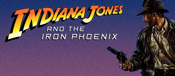
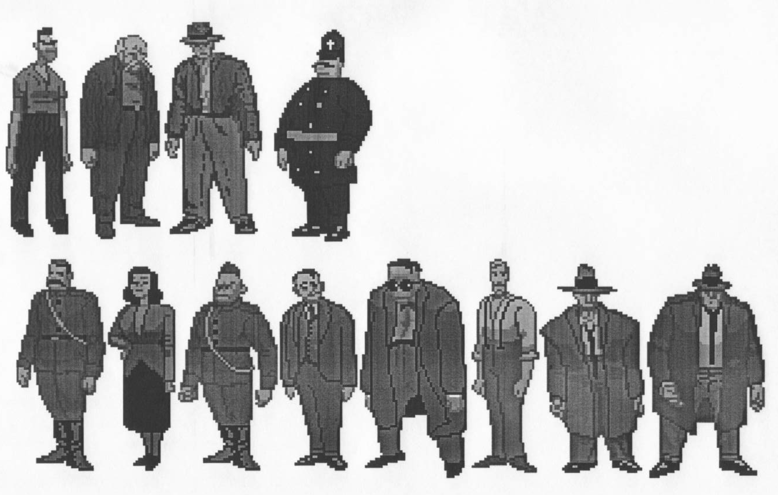
On the art side, a different sort of tug-of-war was taking place. Players will recall that Fate of Atlantis, which was produced alongside Monkey Island 2, was the last LucasArts adventure to feature miniature character sprites, a limitation that was a function of the 320x200 canvas and confined color spectrum of the time. Beginning with Day of the Tentacle, the playable character would occupy far more screen real estate, taking advantage of some extra breathing room to pull off beefier designs. Iron Phoenix would have been no exception, and Bill Stoneham proceeded to craft detailed and realistic background art that would be accommodated by this upgrade.
Lead Animator Anson Jew, however, struggled to perfect the design of the larger Indy that would traipse across those landscapes. Indiana Jones was not Bernard Bernouli – his rendering required a certain degree of realism to be compatible with Stoneham's work, but the task of pulling that off in more generous dimensions required a commensurate expansion of the color palette. Jew found himself shorted on that front; not only was the amount of colors available to him brutally finite, but the technology of the time was such that he shared that palette with the background art, which one imagines took priority.
Taking a cue from Day of the Tentacle, we wanted to work with larger characters. The norm before DOTT in the industry was to have tiny little cartoon characters running around in these vast environments. We wanted to have Indiana Jones in realistic (non-cartoony) proportions, since Indy is an action/adventure character and not a comical one. I was asked to design a realistically proportioned, fully rendered Indy more than twice the height of most of the characters in previous games, but was only allowed to use the same amount of color slots per character as the smaller characters in previous games. Unfortunately, when you double the size of a character in a fully rendered drawing, you also need twice as many colors. If you don't, you get very visible color banding--resulting in a blocky and/or faceted look to the characters. I had a hell of a time trying to communicate this to the (non-artist) project leaders, since this would mean more color slots would need to allocated to animation. And since we were working with a fixed-size color palette, any new slots allocated to animation would have to be taken away from the background art. So there was a bit of tension over how many color slots get allocated to animation and how many to backgrounds. I would have loved to have had more shades of color to work with in order to render Indy properly.
- Anson Jew
The result was a compromised style for the characters that has been described as “Art Deco” and reminiscent of Batman: The Animated Series. Jew notes that some have mistakenly interpreted the look as his premeditated intention when from his perspective it was the inevitable outcome of the constraints he was placed under. In a previous interview we conducted with Jew for our Fate of Atlantis retrospective, he delves a bit more into these challenges.
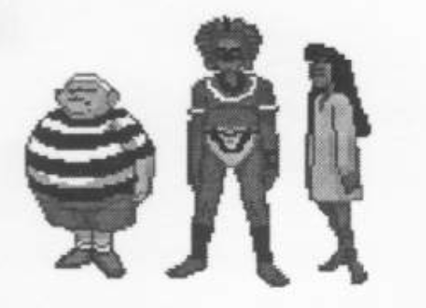
Art assets that might speak to this tension are unavailable. A few of Stoneham's backgrounds have survived as do a few character sketches, but no finalized character designs exist to the present day to judge how they might have married with the environments. The cutscene storyboard sketches we have access to are in black and white and are stylistically reminiscent, to my lights, of The Dig's cutscenes. It's pointless, however, to speculate too heavily based on pre-production materials.