Articles
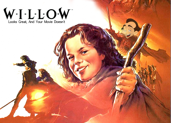
Willow Looks Great, And Your Movie Doesn’t Page One
Modern fantasy/adventure movies look considerably worse than the thirty-year-old Willow, and Jason is pissed about it. We decided to let him air out his long-incubating grievances below, because at least this way he’s not hurting anybody.
Mixnmojo has a news category labeled “Film & TV News,” which is a broadening of the original category, “Lucasfilm News.” There’s always been a place on the Mojo agenda for the cinematic arts, and a dive through our archives will reveal features devoted to the films of Star Wars, Indiana Jones and Pirates of the Caribbean. So what I’m saying, Your Honor, is that my publishing a Willow article is unequivocally within jurisdiction.
I begin this piece on such a defensive note because I admittedly have a reputation for ruthlessly calling staffers out for coloring outside the lines with their unspeakably reckless coverage of Leisure Suit Larry and other subjects clearly in violation of The Mojo Charter™.

I wanted to write something about Willow for the film’s 30th anniversary, but I knew it wasn’t going to be a review of the movie. I have nothing original to say about it. Like many, I see it as a solid if nakedly derivative fantasy film that has more nostalgic than objective worth. Still, the good stuff is really good, and the bizarre tonal whiplash – watch the movie toggle from simpering, cutesy moments to old ladies getting devoured by devil dogs on a dime – carries at least as much charm for me as any storytelling originality would have. And if there’s a more action figure ready character in the history of the silver screen than Pat Roach’s General Kael, we’ve never been formally introduced.
Furthermore, as someone who has watched with numbed apathy as Star Wars received prequel after sequel after spin-off, I admit I can’t help but wonder why Lucasfilm/Disney cannot manage to squirt out a new Willow installment once every thirty years. A quarter of the budget they habitually waste on shooting a movie twice to mitigate the risk that it won't be mediocre enough ought to cover it.
Despite my mixed feelings about it as a movie, Willow is one of my most spun Blu-rays. Why? Because I enjoy looking at it, literally. I'm taken in by the handsome 80sness on display. What should be a superficial quality is a fundamental appeal -- a reminder of a time when genre films could claim a basic appearance that was pleasing, immersive, and tactile. Perhaps because it isn’t overly loved (thus leaving its negative in well-preserved condition) Willow boasts a particularly impressive high-definition transfer that is filmic, detailed, and probably only somewhat revisionist.
But such a winning presentation of an oldie also casts into sharp relief how much worse modern blockbusters look in spite of the many technical advancements that have arrived since 1988. I am pleased by how well Willow holds up visually, but I am alarmed that this pleasure is an internalization of the following sentiment: “Man, remember when movies didn’t look terrible?”
PAST THIS POINT, YOU HAVE IMPLICITLY ACCEPTED JASON’S THESIS
Movies are a visual medium, so how they look is sort of an elemental thing, yet it seems to be an area given less thought than ever. One theory is that this regression stems from the powerful flexibility that modern tools have afforded film makers. What the witness feels, said the judge, is not evidence, but I would nevertheless like to testify that it feels as though we are in an era where a production’s overall aesthetic is left to caprice and color grading presets.
To be clear, I’m not one of those dogmatic Digital Ruined Everything types that blame technology for what human laziness and ego is plainly responsible; the tendency I am railing against here is just as evident in movies captured on celluloid as on memory cards.
Let’s get right to an example. We’ll compare a frame from Willow (which, I reiterate, is now 30 years old and being re-issued on Blu-ray for the occasion) to another Lucasfilm adventure movie made twenty years later: the beloved Indiana Jones and the Kingdom of the Crystal Skull.
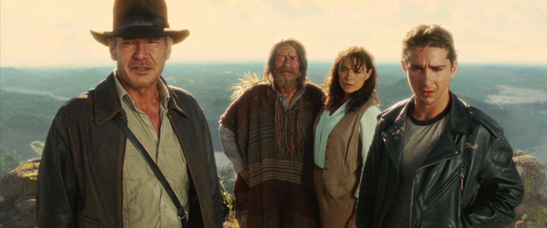
Though Crystal Skull was shot at Spielberg’s insistence on 35mm film stock, you could be forgiven for believing that it was rendered entirely on a hard drive thanks to the mystifying choices Spielberg and his cinematographer, Janusz Kaminski, made both during production and in the DI suite. It is no exaggeration to assert that the film looks nothing like the previous entries in the franchise (which were lensed by Douglas Slocombe), but the problem amounts to more than inconsistency with earlier installments. There is a weird, gauze-like curtain separating Crystal Skull from the viewer that kills immediacy dead. How is a set piece supposed to be gripping if it’s behind a pane of translucent ass?
Let’s see this distancing effect in action by comparing an action sequence from Indiana Jones and the Temple of Doom to Crystal Skull, both of which depict falls from a cliff:
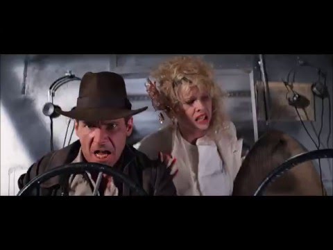

Dated 80s effects aside, doesn’t one of these look vastly superior, while the other sports a bleached, processed, and self-conscious (which is why I insist on the word “ego”) look that makes it more of a blood relative to Sky Captain and the World of Tomorrow than to the series it allegedly occupies?
On top of just being ugly, Crystal Skull’s filtered-to-hell presentation cripples engagement because we can’t buy into the world. It’s not a question of “realism”; the characters don’t seem to exist in a tangible universe where stakes could possible exist, much less matter. (Marion’s blasé, self-assured attitude doesn’t help the suspense any, either. Imagine if Indy had looked so convinced he was in a movie when he was cutting the rope bridge.) Much of the movie, we’re told, was shot on real sets and locations with a heavy use of traditional stuntwork, but if the end result looks like CGI anyway, what was the point of the exercise?
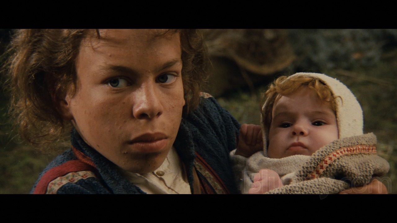
Let’s enlist the birthday boy for another counter-example. Consider the set piece from Willow in which the protagonists escape pursuing soldiers in a wild wagon ride:

Again, ropey green screen aside, the sequence visually holds up quite well because the surroundings are real, and the balance of the footage hasn’t been excessively monkeyed with. The movie gets out of its own way; stylistic choices don't overwhelm and call attention to themselves.
Crystal Skull is not an aberration in its guilt. Stylization that distracts rather than serves has become increasingly common in the last fifteen years, and it lends credibility to the idea that the ease of tools has led to their abuse.