Articles
Willow Looks Great, And Your Movie Doesn’t Page Two
YOUR POWERS HAVE GAINED IN STRENGTH, RAZIEL
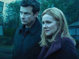
The increasingly ham-fisted approach to color in movies, for example, underlines that the ability to do something is not the same as a reason to. I’ve taken to referring to the Netflix series Ozark as The Color Blue: A Television Show, and after the turn of the century I became more aware than I wanted to of a trend that has incurably infected epic sagas in particular: The draining of the palette as a shorthand for “serious” or “mature.”
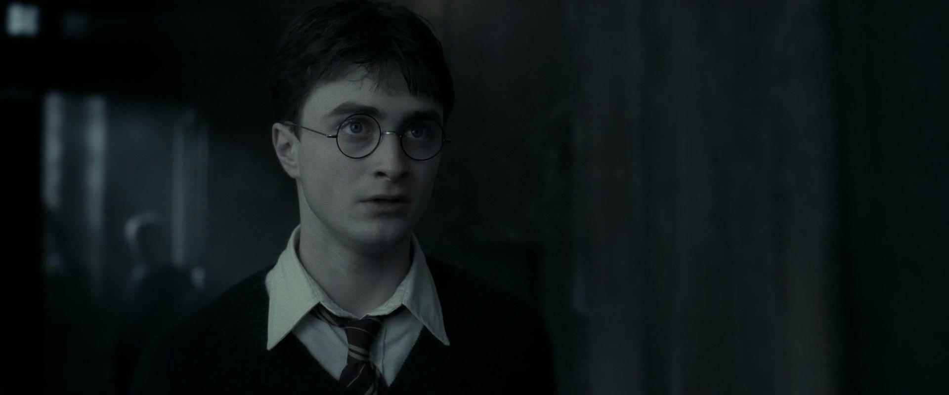
Movies both good and bad are guilty of this cliché, which seemed to propagate wildly after digital intermediate entered the workflow, and the pattern is most easily observed when it is adopted by a long-running series. Note how the Lord of the Rings and Pirates of the Caribbean trilogies veer closer to monochrome with each installment as the stories move toward themes of annihilation. By the end of the eight-film Harry Potter series, the desaturation gets to a point where I think we’re left with about three colors of the rainbow to work with. It might interest the clowns in the editing suite to know that even in the actual apocalypse, the human eye is still going to be able to resolve the full color spectrum.
I exaggerate for humor -- obviously, these choices aren’t always inappropriate, and I don’t object to any of them on an individual basis, but there is an aggregate effect here. What was once employed for embellishment has become an outright substitute for creating mood. Tone is no longer something to be established in the storytelling itself, but simply outsourced to a knob. You want your movie to be “bleak”? We have a filter for that.
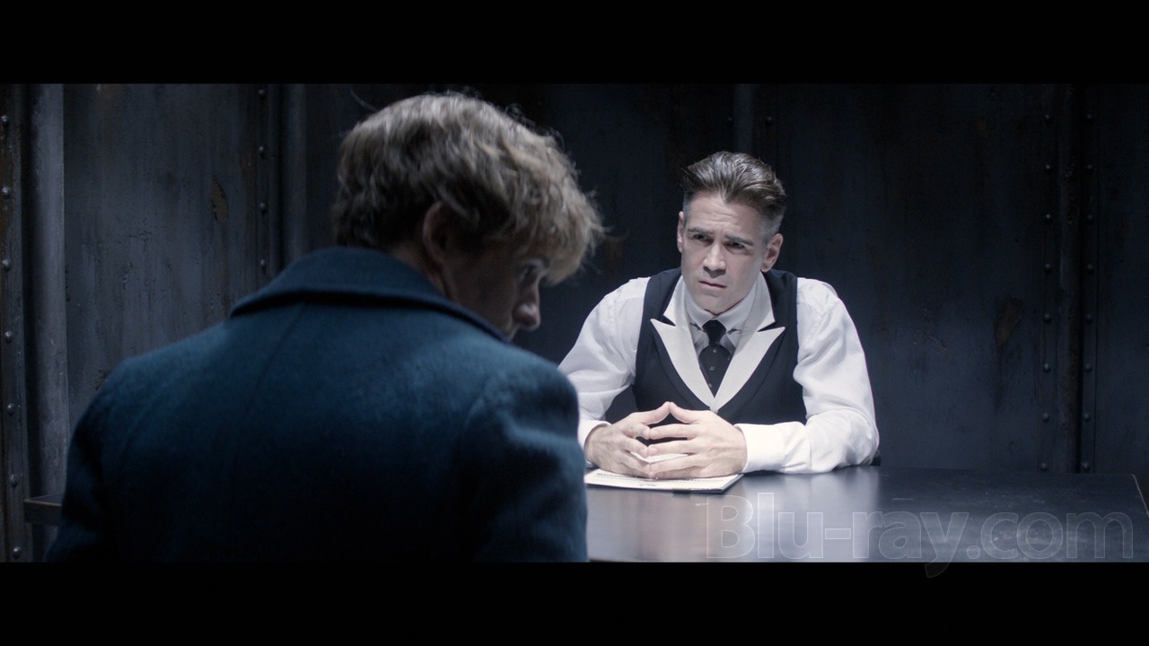
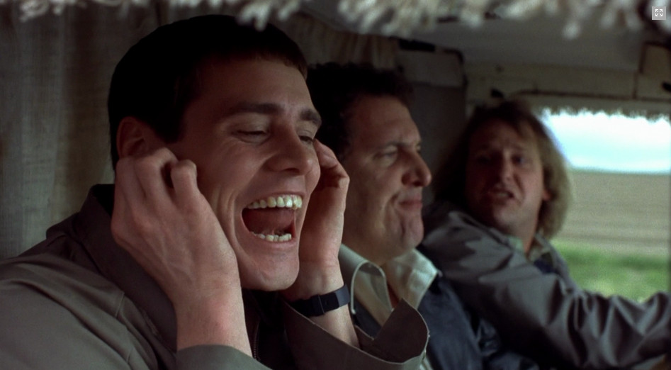
Fantastic Beasts and Where to Find Them, a $200 million movie that found profit without my help, was nevertheless on somebody’s television long enough for me to discover that the latest fad is for fantasy films to be whiter than I am:
You might have noticed from these examples that color is not the only area suffering from a lack of considered ideas. The modern tentpole, it seems, is a host organism for unmotivated diffusion, blasted and halating lighting as a seemingly default choice, and an excessive use of CGI for reasons that have squadoosh to do with Lovecraftian creatures or background plates, but to “fix” what would have been left as-is in the past. Such faults include the landscape of the human face, which can be cheerfully scrubbed away to turn actors into wan mannequins.
Perhaps because it’s easier than ever to Xerox another movie’s look with dials and templates, the advent of extreme versatility of control has ironically left movies looking homogenized, while the immature fixation on employing techniques because they are available has contributed to much of cinema resembling a wedding videographer’s demo reel than feature films as we once recognized them. The following may be a strange example, but I think it’s a pretty revealing one in terms of the “progress” of twenty years, which is hardly limited to fantasy/adventure films:
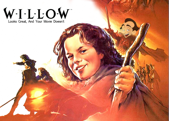
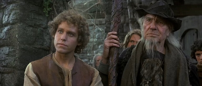
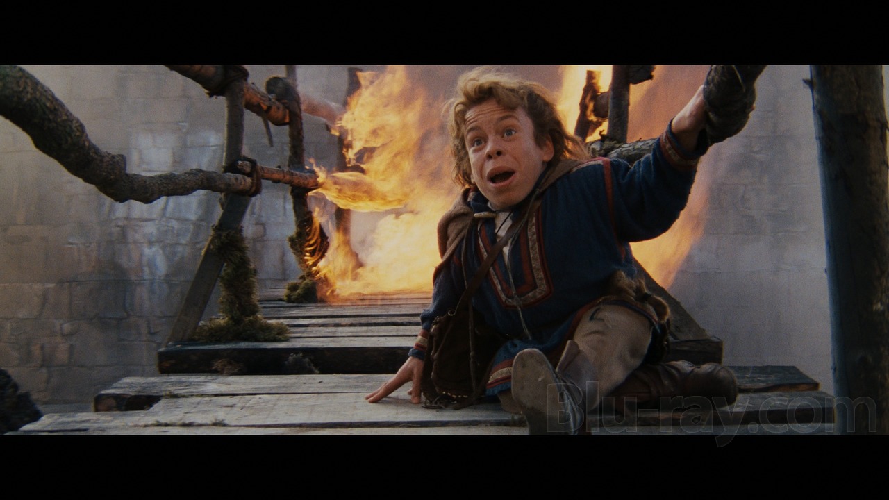
Is it any wonder why I reach for my Willow disc as a respite from that garbage? To be sure, Ron Howard’s masterpiece is a convenient and cherrypicked representative of The Past for my purposes because the 80s weren’t that long ago and the movie had a bigger budget than most. Also, it helps me justify this diatribe for Mojo.
It is of course true that the 80s had plenty of ugly looking movies, high fantasy or otherwise, but I think even the less flattering examples illustrate the point that a movie’s look, good or bad, was at least the result of conscious choices at one time, even if by photochemical necessity. Krull, an 80s sword-and-sorcery film notorious for its foggy drabness, still has the benefit of looking like it takes place in a tangible, three-dimensional space. Dragonslayer (co-written by Hal Barwood!) is another 80s fantasy set in a grim world that nonetheless avoids the specifically glossy, sterile grimness of its modern analogues.

YOU HAVE MUCH TO LEARN, YOUNG UFGOOD
To wrap things up, let's pretend that what I've been getting at here is that Willow should get a little love for its 30th anniversary. This is a movie whose faults are often magnified, so we should allow the pendulum to swing the other way and aggressively appreciate Willow not just for the pleasures it offers by design but for what it represents by accident: a time when our escapism had their visual identity defined in geographies other than the post house, and almost always looked better for it.
I’ll tell you something else. Willow may have taken lumps over the years as being a flagrant rip-off of Tolkien, but considering what WETA’s celebrated vision of Middle Earth looked like by the time Peter Jackson got to The Hobbit, I am no longer convinced that it is an inferior one.

The bones have spoken.
A rant by Jason, a peevish gargoyle who has been incapable of enjoying movies since 2001.
Header image by Remi.
Movie screencaps sourced from: