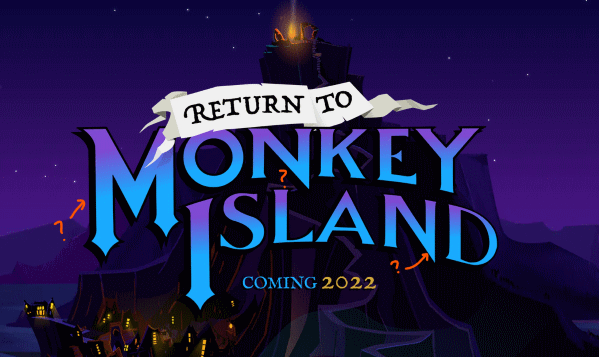
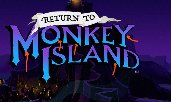
While we at Mojo are excited about Return to Monkey Island, we also cannot shirk our journalistic integrity and report on scandals surrounding the sixth entry into the franchise. Anonymous sources have sent us a comparison of promotional logos, one from the website and trailer and one from the website’s OG image. (The latter being the one you see when you link to the site on Twitter.) To wit…


One is in the style of the original logo, the OG closer to the one from the Tales of Monkey Island era. One hydrated, one shriveled. What can we read into this? I think it’s safe to say it is all part of…  Although, it’s hard to say which logo is censoring which, I think it’s safe to say that the purists amongst us prefer the original. We are also old, so take that for what it’s worth…
New OG image
St_Eddie
Nostalgia be damned. The rejigged logo is superior. The torn map effect suits the pirety nature of the series.
I mean, it's all taste of course but I agree. The updated logo from the newer games modernised it a bit while still feeling respectful towards the original, and I think the 'torn map' effect feels nice and piratey. I think the torn map version of the return logo is a nice compromise between the two.
OzzieMonkey
Lol the hype has slowed down to the point where we're analysing logos.
Clearly, you weren't here for the EMI days. ;