Articles
Tiller Techniques First Edition

Welcome to the First edition of Tiller Techniques, the quarterly article series right here on Adventure Developer to help the average developer improve his or her image composition skills, discussing styles, techniques, and plain ol' artistic know-how.
now i'd hate to get in Bill's way, so I'll let you go ahead and read the first edition focusing on a piece of work done by a certain Giuliano D'Angelo, aka DANSKY.
I very much like this picture because of it’s use of simple and clear shapes as well as bold use of line. There are just a few things I would change about it because it is a successful picture.
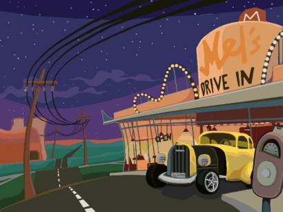
The job of any artist is to fulfill the requirements of the assignment, or complete the goals of the concept. In this picture the goals seem to be a.) Show a desolate highway, b.) Represent a 1950’s car c.) Display a nuclear power plant in the distance, and d.) Show the main set, in this case a 50’s drive in diner.
This picture succeeds on all accounts. But succeeding and excelling are two different things. I was taught at Cal Arts that once an artist has succeeded in fulfilling the goals, they are only half way to being done. It is then time to take what works and make it great. Make it something exceptional. Push it to a new level.
So after determining that this picture works and does what it needed to do I began to think of ways it could be improved. My first thought was that the main set piece, the diner, is too far off center. Though it is good to have your subject a little off center, too far off center can cause the viewer to wonder where they are suppose to look. The values of the piece seem to be to even as well, and some contrast would really hep some of the shapes pop out. There are two ways to fix these problems: stronger silhouettes of the main shapes, and moving the main object more toward the center.
Composing your art is THE most important step in creating an illustration, especially art for the entertainment business i.e. animation, computer games, comic books etc. The golden rule here is make varied but clear shapes.
One of my first assignments at art school required me to draw a giraffe and mouse eating dinner. It had to be in black and white silhouette and I had to include a chair, a table and a stool. This is what it looked liked.
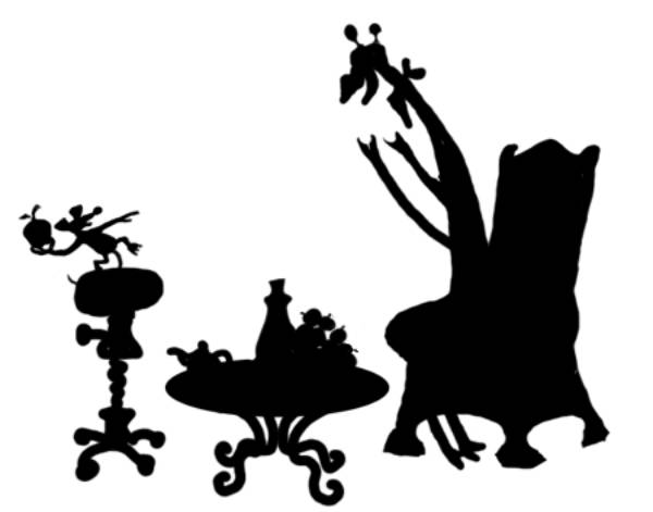
It took me a couple of tries, but eventually with the help of my friends and my professor I go it right. The chair, table and stool all have various heights and widths to help make the composition interesting. I also tilted the big chair ¾ to the right so that we don’t look at it straight on or directly from the side. This too creates varied shapes as seen in the example below. The characters were drawn in extreme poses to make their attitude and body shapes clear and to convey a sense of action.
So the lesson here is varied shapes are good, even shapes are bad. The above shapes shows how a simple tilt to the left can create a variety of shapes.
When starting to formulate your composition you should start be creating the most important shape in silhouette first. Make sure you or other people can understand the shapes before you proceed to adding the details. A person should be able to understand what they are looking at when viewing your silhouetted shapes from across the room without hesitation.
Now how does this apply to the picture of the diner?
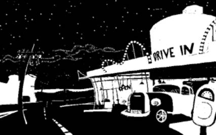
I created a version of the picture to show you the current silhouettes. The biggest shapes are the dinner the car and the power plant. The car and the dinner blend into each other too much. The parking meter and the power plant are too prominent. Time to push them back and bring the diner forward so that their silhouettes looks more like this.
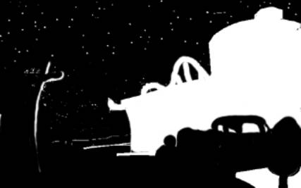
Not perfect, but better. We can’t see the whole car because the Parking meter cuts the end off. And we can’t see the power plant at all. The shape of the diner reads well, so does the roof of the car, and the telephone pole. To improve this I am going to move the car out from the parking meter and brighten up the road. This way the whole shape of the car becomes clearer.
Picture missing
I also moved the meter over and left a good-sized gap between the two shapes so that they don’t interfere with each other. So now clearly the diner and the car are the easiest things to see in this picture. But the other important information is missing, the power plant.
The power plant is the secondary feature after the diner and car, which are clearly the two primary features. This means the power plant can’t be as high contrasted as the primary features. So now it is time to use grays. We are still trying to create silhouettes, but instead of black in white we use charcoal gray and light gray. My suggestion is to make the sky brighter and leave the power plant dark like this.
The brightening of the sky helps create the shape of the power plant as well as the wire poles. The right cooling tower shared a line with the foreground pole so I moved it over to the right to make it clearer, so the two shapes don’t fight with each other.
This image now clearly depicts the major shapes. None of the detail exits yet, because the major shapes are the most important things in the composition of any art piece. You will also note we have a good variety of shapes from fat and long, to skinny and tall, plus all the shapes are turned ¾ away from the viewer to give those shapes even more variety.
When adding the details to the shapes be mindful of how strong the shape is and how dark or light it needs to be in order to be seen clearly. Also ask yourself if the details you are adding is competing with the primary shapes.
Picture missing
In this version the power plant is just a simple shape. If it needs to be clearer I would suggest putting lights on the bottom of the shape fading out near the top. This way the top of the plant is silhouetted against the sky while the ground is silhouetted against the bottom of the plant, like so. The light should not be of a high value, just high enough so that the shape is clear. This added light helps bring the power line poles out too.
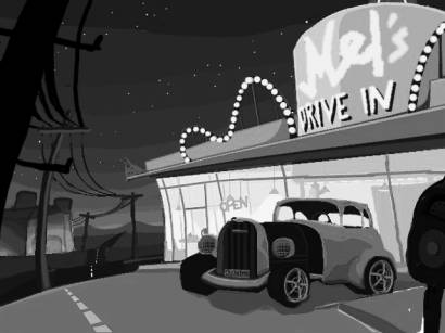
I also removed the power lines from the center of the picture to the left because I felt the sky was a nice area to leave empty. It is good to have a balance or empty areas and busy areas for the viewer’s eyes to rest at. The sky and the road provide those resting areas here.
I also added another power pole to the left to help frame the scene as well. We have the meter on one side and the pole on the other to help focus the viewer on to the diner and the car.
I think with theses additions, moves and changes in value the image is working really well. The only other thing I would change would be the color, but color is whole other subject and can be very subjective, with preferences changing from artist to artist. There is no right color but there successful ways to achieve and effect on the viewer. For this image I would punch up the yellows in the light areas and push the blues and purples in the dark areas. Yellow and purple are complimentary colors, and so is orange and blue. So I suggest using them here too, if you wish. Again, there is no right or wrong, just preference. Here is a version of the colors I would use. (Please note I worked on the color before I worked on the composition so ignore the fact that the car and the meter are right next to each other.)
Picture missing
The take away ideas from this lesson are as follows.
- Start your composition by drawing out the silhouettes
- Use interesting and clear shapes
- Turn objects ¾ from the viewer to give them more interest
- Give all the major shapes room to breath, don’t crowd them
- The eye goes to the place of the greatest contrast, and that is where your most important information should be i.e. the diner and car
- The secondary shapes should be silhouetted too, but with much less contrast.
- Frame the image with objects in the foreground.
- Leave areas of blank space so the viewer’s eyes can rest
- Use complementary colors to draw the viewers attention to areas of most importance
In the future I am sure to be harping on the same themes over and over again. I suggests to all of you to see if you can take the rules I have given here and apply them to you compositions.
I might also suggest challenging yourself with similar assignments like the one I received on creating silhouettes. Try to get a horse and a fox playing chess to read in silhouette, or a rhino and a snake playing volleyball at the beach. It doesn’t matter what the subject is as long as it is challenging.
Another suggestion I have is that you should go back to previous Lucas Arts games like Day of the Tentacle and Sam and Max and see how the background artist, in this case Peter Chan and Paul Mica, used these same rules in their art. Looking at other illustration can be helpful too, and you can see how each artist solved the challenges of making their compositions readable.
Till next time.
Bill Tiller