Articles
Maniac Mansion and the Orphaned Tone Page One
Contrasting their distinct look and feel, Jason examines how two great, and greatly different, games show off the remarkable flexibility of a series that remains bafflingly unexploited.
Like everyone else, I love Day of the Tentacle. For reasons that ought to be obvious, the successful sequel to Maniac Mansion eclipsed its predecessor in popularity and acclaim, and it’s reasonable to assume that most people who are familiar with the universe of the Maniac Mansion series have Tentacle’s take on it as their point of reference.
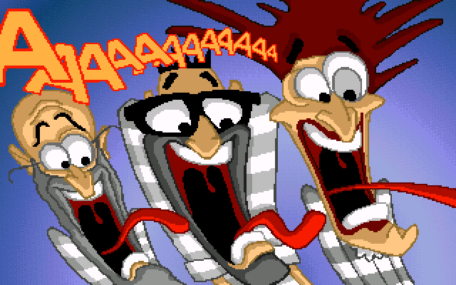
And that take is awesome: a frenzied valentine to Chuck Jones and Saturday morning cartoons in general, with the rapid maturation of the SCUMM engine debuted by its distant predecessor here enabling a small team of artists and animators to actually achieve this result in-game rather than it being some hypothetical suggested by the box art, which for once accurately foretold the visuals that would appear on the monitor.
But what’s interesting is how different that result is from the original game. A related observation might be made in comparing the still litigated visual identity of the third Monkey Island against its predecessors, and in both cases the shift in aesthetic came in part out of the large gap between installments. The six years separating Maniac Mansion and Day of the Tentacle is a lifetime by tech standards, and Maniac Mansion was made under circumstances that all but precluded an “art style”; the original version of the game had its hands full just trying to depict its characters and environments with sixteen colors across a canvas of 320x200 pixels, much less imbue them with oodles of personality. For the game’s subsequent “enhanced” edition, artist Gary Winnick was able to retain a bit more of the charm of his original concept art, though in any version it’s fair to say that the graphics of the first SCUMM game were up against a brutal ceiling.
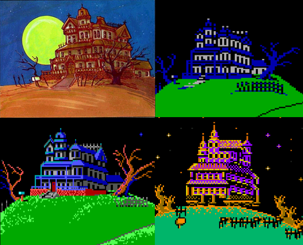
The case is a little less extreme with The Secret of Monkey Island, as even in its original EGA version, developed under “Version 4” of the SCUMM engine, a conscious art direction comes through. Still, Steve Purcell’s box art for The Secret of Monkey Island and Monkey Island 2: LeChuck’s Revenge do not much resemble even idealized screenshots of their respective games so much as speculative movie posters. Day of the Tentacle and The Curse of Monkey Island, on the other hand, come a lot closer to blurring the gap between the promotional materials and the games themselves in a way that earlier tech would have prohibited. The teams of those sequels had a luxury denied to their predecessors: the ability to conceive a style that they could then more-or-less faithfully realize in-engine, as opposed to the style itself being a cart largely dictated by aggressive hardware limitations.
However, those limitations come with a luxury of their own, as the somewhat reluctant acceptance of Curse of Monkey Island’s upgrade in the online community demonstrated. Both sequels in question delivered a style which many fans – some more politely than others – noticed was more “cartoony” than its comparatively “realistic” predecessors...even though a large part of that latter quality was surely illusory. It’s easy to fill in the details of Guybrush’s EGA universe with you own imagination when you have no choice but to do so.
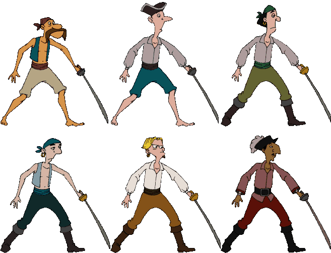
Purcell’s concept art of a pirate for The Secret of Monkey Island that showed up in The Adventurer Issue #1, versus in-game pirate sprites from The Curse of Monkey Island (GIF source: The Legend of Monkey Island). Larry Ahern’s pirates are distinct in style from Purcell’s, but they’re surely both “cartoony.”
Still, for however influential the end user’s system requirements no doubt were on what these sequels look like, there is no denying a conscious departure to some extent, and in Day of the Tentacle’s case even a change of genre. Maniac Mansion, as conceived by designer Ron Gilbert and artist Gary Winnick, was a B-movie homage, with acknowledged points of reference including Creepshow (in which a bumpkin played by Stephen King undergoes macabre transformation after a meteor crashes onto his property), The Re-Animator (a Lovecraft adaptation featuring a mad scientist who smuggles bodies into his basement) and The Little Shop of Horrors (which features a man-eating plant).
All these horror/sci-fi sources are of course filtered through the game’s overtly zany sensibility, but it’s still a different enough set of influences than the Warner Bros. cartoons that served as the touchstone for the sequel to produce a rather different world for the player to navigate, one which for all its whimsy and absurdism still had a dangerous and perverse edge.
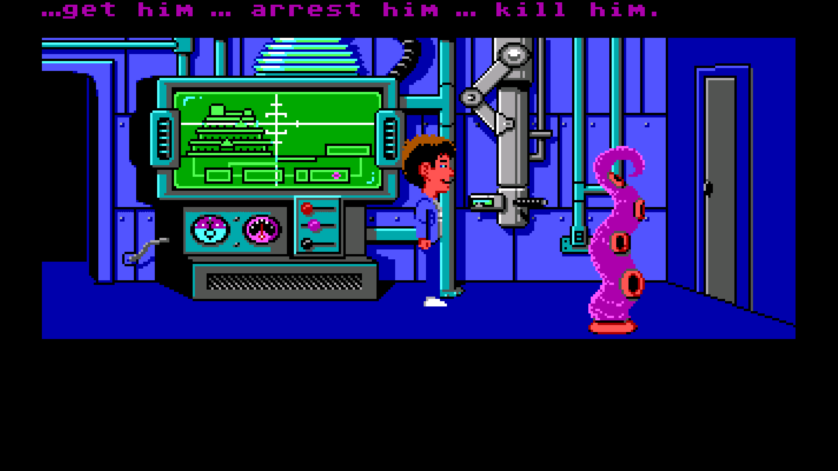
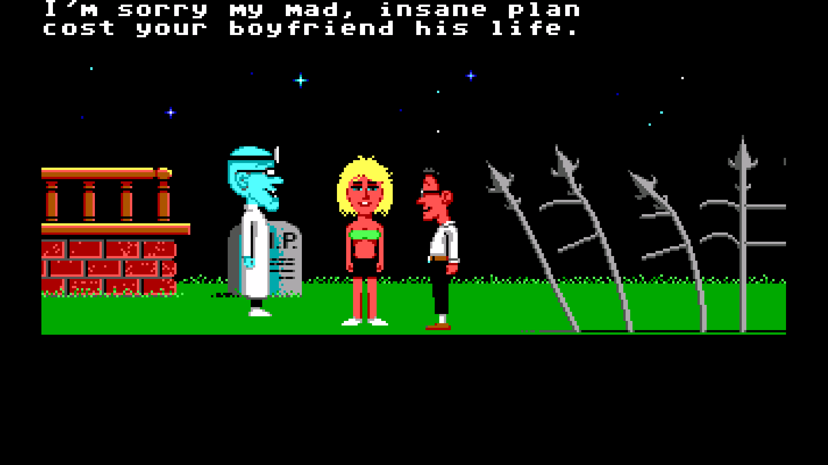
The danger is literal for the characters in a way that wasn’t true of later LucasArts games. Maniac Mansion was the first graphic adventure LucasArts produced (unless you count the finale of Labyrinth) and thus developed at a time when the studio was in the process of formalizing the rules that would distinguish its approach to the genre. Though still forgiving by the standards of the competition (it practically has training wheels compared to a Sierra game of the time), you could get stalemated in Maniac Mansion, and you could certainly die – and often grotesquely, despite a character’s ultimate fate being implied rather than actually depicted on screen.
Characters can be drowned, nuked, irradiated by reactor coolant, and murdered by an enraged Weird Ed or a jealous Green Tentacle. In an especially bizarre scenario, your playable teenager is apparently raped to death by Green Tentacle when a recording of a “Tentacle Mating Calls” record is played for the mutated pet. Somehow, that particular end state didn’t make it past Nintendo’s censors for the console port, and Green Tentacle is reprised as an unambiguously cuddly ally in his 1993 incarnation. The fate of the world may hang in the balance in Day of the Tentacle, but it never feels as intimately dangerous as the decidedly pitiless original game. Death isn’t an empty threat in Maniac Mansion.
A little bit of autobiography may help explain why I was so spellbound by qualities that might have been comparatively inert for others. It was with the NES version of Maniac Mansion that my story as a LucasArts fan begins. I first played the September 1990 release, my gateway to the graphic adventure genre, as a child. As in, less than five years old. A compulsive gamer at that age – more so than I would be later in life – in part thanks to the access afforded by an older brother, I consumed all things NES that the local video store could loan out to the household. The result was the loss of countless precious hours to the likes of Mario, Zelda, Mega Man, Double Dragon, Ninja Gaiden, Contra, and all the rest. It’s not an addiction that anyone who came up in a certain era would exactly struggle to relate to.
But Maniac Mansion was an altogether different rental. Gameplay-wise, it bore resemblance to none of the side scrolling, beat-em-up and open world games that I was accustomed to, but most of all it stood apart in its feel. Namely, how it actually had one. Somehow, the experience seemed a bit heavier than what other video games trained you to expect, as if gravity actually had jurisdiction within this cartridge.
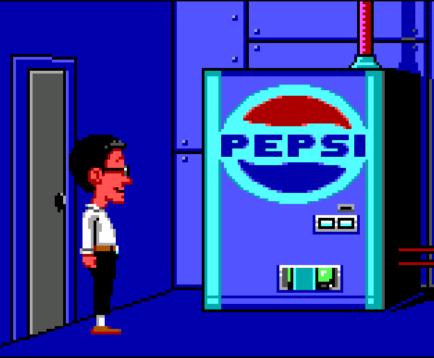
The game world presented a reality of sorts. This verisimilitude was achieved through a number of design choices, and even through touches as superficial as product placement (what other Nintendo game has a can of Pepsi in the fridge?). It all translated to an unmistakably new experience from my side of the television -- a genuine atmosphere was being generated in a way that I hitherto only encountered through books or filmed entertainment, and the game became my obsession.
The setting of the mansion seemed to be a tangible, enclosed space. The house had a ruthlessly defined geography that adhered to at least a parody of proper scale; if you wanted to walk from one end of the Victorian home to another, you had to actually make that walk. The rooms felt three dimensional, and there was no guarantee you’d enter one to find it empty; it could be suspenseful to walk through the next open door, because you couldn’t be sure what crazed character or creature (I mistook the hyperactive sprite of Green Tentacle for – no joke – a haunted vacuum cleaner, and took the green-tinted Edisons for aliens) might be lying in wait to react to your trespassing. Characters had dialog, personalities, and motives. There seemed to be real stakes, and the threat of real consequences.
It wasn’t just the fact that characters could die – as irritated as I would get, it’s not like I took it personally whenever Mario fell into a bottomless pit – but the implication that they remained dead. And the cutscenes, which allowed you fragmented but privileged access to activity elsewhere in the mansion, provided the sense that the game world was alive, occupied, and hostile. After all, you are an intruder, and the risk of your path colliding with that of the roaming residents was ever-present.
This anxiety was compounded by the extra mile the programmers went in mobilizing the Edisons: when Weird Ed is coming downstairs, he actually passes through every room on the way to his destination in real time, creating the possibility for conflict if one of the kids is left haplessly standing on his route. If you enter Nurse Edna’s room and then retreat as she gives chase, she will actually emerge out into the hallway to pursue you. She didn’t operate under the same, trustworthy limitations as the respawnable enemies of other games. While Koopas and Octoroks always seemed by cosmic forces to have no authority outside their defined area, Maniac Mansion flipped the script on me, and with knowing impishness.
I suppose it can seem silly to tout these “cinematic” qualities at too much length, even to an audience of adventure gamers who can relate to the subjectivity of that first, visceral experience with a story title, and at an impressionable age. Maniac Mansion is the first foray of a storytelling presentation from a studio that would elaborate upon it, refine it and push it much further. By comparison to what came after, Maniac Mansion is primitive, to the point where I can imagine some skepticism that I could have ever been engrossed as deeply as I describe. “We can buy that you were held captive by The Secret of Monkey Island, yes, because LucasArts had found the formula by then, but Maniac Mansion didn’t have much of a story! The dialog trees weren’t even there yet! The character sprites look like they were made from giant LEGOs! There was barely any animation! The sound design was minimal!”
But those would have been meaningless observations to the kid that was gripped by the game’s sinister edge, heist-like thrills and morbid overtures, even in its compromised-by-Nintendo-of-America form. Whatever power Maniac Mansion once had that might now be diluted, mooted or rendered obsolete by the march of time or the clinical eye of academic hindsight was nevertheless very present for me in those formative encounters. And while my experience might not be ubiquitous, I don’t think it’s an aberration, either.
And the fact is, I just can’t picture even the most impressionable player ever feeling similarly worried while playing Day of the Tentacle, which is simply up to other tricks. So for however much the shift in tone from one game to the next was an artifact of engine upgrades, clearly a difference of vision was at work. And perhaps the best evidence for that, or at least the most fun to review, is the fact that Day of the Tentacle was not the first attempt to artistically render the Maniac Mansion universe unencumbered by the constraints of SCUMM, Version 1.
