Articles
The Mondo Vintage Bill Tiller Interview Page Two
What was it like to work for LucasArts?
It changed all the time. When I first got there it was like a small family and the culture was pretty laid back and creative. Aside from a couple of console games and the Star Wars 3D game (Rebel Assault’s early name), all LEC was making was original adventure games. Then a year later we started making Star Wars shooters and 3d CD-ROM games. Then the company started getting hardcore 3d gamers in and Star Wars moved in to the forefront. That was an exciting time. Doom had just come out and we were well on the way to making our own first person shooter. It was a nice change of pace, but it definitely changed the feel of Lucas.
Then in 1994 we moved to a bigger building and things started to feel like a normal company in some ways, but the projects themselves developed their own sub-cultures, and that pretty much kept that small family feel. In the mid-nineties we experienced phenomenal growth, but remarkably, the same Lucas culture that had existed before was still maintained.
They are still growing but not anywhere near as fast as before. My workday usually consisted of reading a lot of e-mail in the morning, especially on the Quake alias, drawing on paper, scanning it and digitally painting over it in Photoshop. Or creating textures and testing them out in our level design program. I also used to go over the art hours, make deadlines, give art direction and give out assignments. Then it was off to meetings--lots and lots of meetings!--Meetings with Project Leaders, meetings with programmers and meetings with Level Designers. Did I mention I went to lots of meetings?
Are there any funny moments that stick out in your mind?
During the Dig we had all these fluffy foam toys and rubber Bocce balls lying around our desks. And once in awhile someone would try to find the right moment to scare the heck out of the other guy by tossing the toy/ foam thing/ Bocce ball at his or her keyboard and monitor. This would then start a chain reaction and pretty soon stuff was flying everywhere from everybody. This mayhem would last for about five minutes and then we’d get back to work. I often got into someone else’s e-mail and asked the entire company if they had any Preparation H (a hemorrhoid ointment). One time I suggested that when Indy killed a Communist guard that we program in an animation of the guard’s family rushing out to his dead body crying his name and cursing Indy. I am not sure why didn’t make it in to the game. Hal and I would do weekly ‘rounds’ on Indy 3d, basically looking over the level designers work for the week. So once I temporarily changed Indy’s back texture so that it had a ‘kick me’ sign on it. Hal was amused but definitely wanted it removed ASAP.
I can’t think of any more, but I am sure there are tons I haven’t mentioned, like the time I sent a huge image file to everyone at the company and it clogged up the whole e-mail server. That was great! Funny thing though, the president didn’t think it was all that hilarious when we were in his office chatting it up after that prank.
Please describe the art process in CMI. How was it designed, how was it made, and implemented into the game.
I think you should just put a link here to my Game Developer’s Conference speech. That pretty much covers this subject. But for those people who don’t want to read twelve pages I will give a Reader’s Digest version.
The Project Leaders would give me a written description of a room or a small rough sketch and then I would make five or six sketches, in rough form, to show them and get feedback. I would then scan the rough drawing in to Photoshop and make all the changes the PLs wanted there. This rough scanned in sketch also went to the programmers and was used as temporary art so that they had some thing besides programmer art to work with. I would then print the scanned rough sketch out on a black and white laser printer. The printer paper was too small, 8” and a half by 11”. I would then blow up the printed sketch with a photocopy machine till it was about 11” by 14”. That was the size of the marker paper I would use, and I used marker paper because we had a ton of it lying around, thanks to Peter Chan, and the pencil went on it more smoothly than sketch paper.
I did all this scanning and photocopying to keep the proportion of the small rough sketch correct, because it was what the PLs approved and I wanted it to be accurate. I would then slip the photocopy under a piece of marker paper and sketch over it with blue pencil. The marker paper was almost as transparent as tracing paper but it was stronger and scanned well. I used the blue pencil because it is very light and I could sketch the layout without worrying about any mistakes because it wasn’t the final drawing anyway. The final step was to take the blue sketch that I just finished and put that under another sheet of marker paper and with pencil, draw the final line drawing. This was the final image so it had to be sharp and clean.
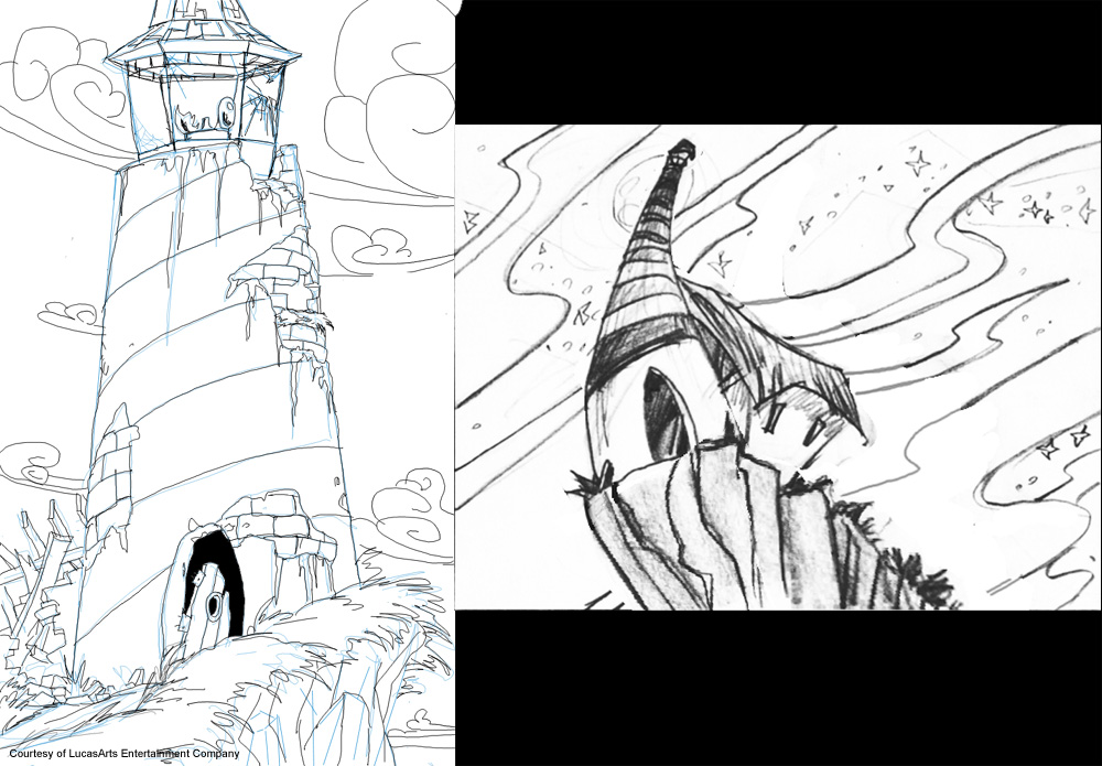
I would then scan it back in to the computer. In Photoshop, I would paint in some rough colors for my background painters to use. This was painted under the finished line drawing on a digital layer below the line drawing.
Next I would either do the final painting myself, if I had time, or I would hand the color rough over to Maria Bowen or Kathy Hseih for them to do the final painting. The last step required me to reduce the colors down to 245 from eight million. For this step I used DeBabbleizer, a program that specializes in just this sort of thing. The game could use 256 colors but the backgrounds only had 245. The rest went to the interface, inventory and to Guybrush’s palette.
I would then make the object states. These are the various frames that any interactive object in the game could be in. An example would be drawing a door open and then doing a separate drawing of the same door closed.
Once all this was done, the programmer would get the final art from me and save it over the programmer art. The programmers and PLs would then try the room out by walking Guy Brush around and interacting with the objects in the room. If there were any problems I would go back and touch them up in Photoshop and/or Dpaint.
Having worked on a 2D and 3D game, which did you enjoy more? Which was the most challenging and which gave you the most freedom?
3D is by far the most challenging. At the moment PCs can’t handle the number of polygons it takes to mimic real life--yet. Curves are unheard of in 3D--at the moment. But very soon, tomorrow in fact, that will all change.
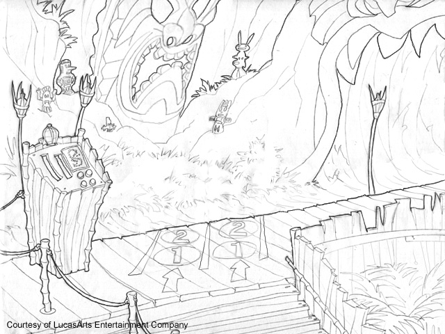
2D on the other hand, is very easy. I just draw what I want and in it goes. It is basically just traditional art painted in the computer. 3D games have great advantages over 2D though, like when it comes to animation. It is easy to stay on model. Often times 2D animators draw the same character differently from other animators doing the same character. This is called ‘being off model.’ In 3D this is not a problem because everyone use the same 3D model. It also saves time when it comes to animating walk cycles. In 3D you only have to animate the character in one direction and the program turns the animation around in real time. In 2D an animator has to animate the character in five or more directions.
I enjoy working on both, but I think 3D is pretty much the future of games right now. It just works so well with the kind of environments that we game developers are trying to create. But 2D artwork will always hold a special place in my heart.
A few fans of the MI series didn't find it easy going from the MI2 look to the CMI look; did you, at any time during the making of CMI, ever consider making the backgrounds look less cartoon-like and more like the ones in MI2?
In the early going I figured we would do that, but it seemed like a wasted opportunity if we just did the same thing. Plus we now had high-resolution graphics, and besides, the last Monkey Island game came out five years earlier. We felt the door was open to update the Monkey Island look and give Curse of Monkey Island its own unique feel and style.
But I actually think the backgrounds in Monkey 2 are very cartoon-like. I mean, you wouldn’t mistake them for photographs would you? Plus, Steve Purcell and Peter Chan did a lot of the MI2 art and they are both excellent cartoonists. So I think the MI art style was already moving in a cartoon-like direction back on Monkey Island II.
There are a number of other factors that went into Larry and Jonathan’s decision to go further down that road. Many of which are quite practical. I never quite understood why cartoons look the way they do until I started studying them in art school. When a character is designed for 2D animation it has to be drawn in such a way as to be simple for the animators to recreate over and over again. But if one is animating a realistically proportioned character, the designs tend to look flat and boring. The animated Star Trek TV show pops to mind as a perfect example of this. Those animators tried to get the animated characters to look just like the real life Spock and Kirk. The result tended to look like characters from a coloring book--flat and boring. So most animation character designers shy away from the realistic proportions if they can help it.
We didn’t want the characters to look flat and boring in Monkey 3. It might be possible now, in 2001, to do a fully rendered 3D version of Guybrush from the close-up shots in Monkey 1. It might have been even cheaper to do Guybrush as a live action character and have all the backgrounds in 3D, but it would have just looked weird.
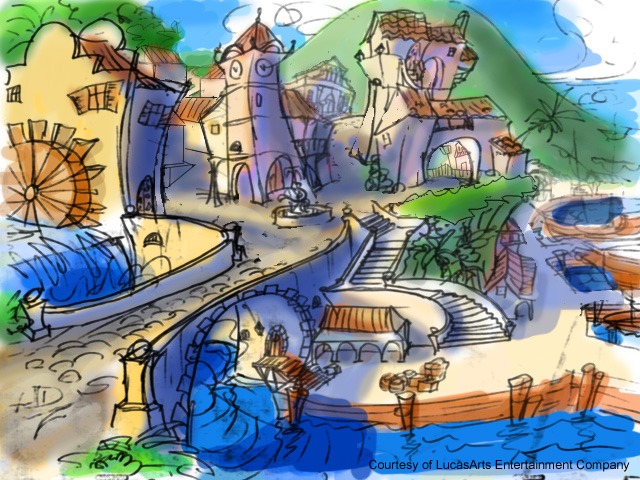
One way to get around this problem is through the use of exaggeration. With exaggeration you get the viewer to clearly see and identify the character’s distinctive features easily, and it tends to be more pleasing to the eye. I think this may have something to do with the way the mind recognizes faces, by comparing people's features with the feature stored in the brain's memory--something I read in Discover magazine. There is something appealing about cartoon characters and caricatures. It is easier to show people than to try and explain it through my limited writing skills.
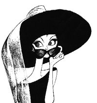


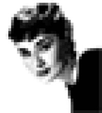
Above are four pictures of the same woman, Audrey Hepburn. One is a caricature, the other is obviously a photograph and the third is a simplified line drawing of the photograph. The most interesting image is the first one. Why? It works because the image is simple, clear and captures the eye using high contrast line work. This is what we did with Guybrush in CMI. 2D animators can most easily animate this style of character.
The second one is nice too because it has all the subtle shading and highlights that we see in real life, plus there is tons of minute details that help define the image. This is what Ian McCaig did with Guybrush’s close ups in Monkey Island I. This style, which uses a lot of details and rendering, can’t be done in 2d animation.
The third one just sucks. Why? It sucks because it doesn’t have the strengths of the first two images. It is perfectly proportioned and it has simple lines making it easy to animate, but it lacks character. This style can be done in 2d. You often see this done when famous people or characters from movies are animated in TV shows.
The fourth image is an example of what a 2d animator using Dpaint would have to draw frame by frame if Hepburn was a character were in Monkey I or II. All those pixels require the animator to spend a lot of time rendering each frame, and animating all those subtleties. When the character is small, the time needed to accomplish this is manageable. But when we moved to high-resolution graphics, animating the old way was impossible. Animating on paper was the only way to get it done on time, and that meant we needed to redesign Guybrush. Animators need simple lines and shapes to animate. But the character needs to have personality and the only way to have both is through the exaggeration of caricature.
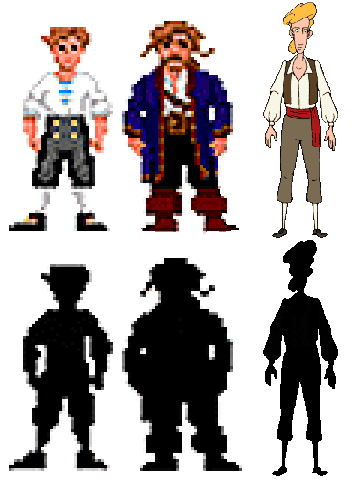
We wanted to make Guybrush 1.) Easier to animate in paper and pencil (couldn’t use Dpaint Animator for high resolution) 2.) Make him look more like a skinny geek which we felt represented his character more accurately, 3.) We wanted to make him more like the Guybrush from Monkey Island I with the costume and the blond hair from the cover and from the close ups and 4.) We wanted to make him more interesting, thus the whole exaggeration caricature thing. In the above image you can see the shapes of the different Guybrushes. The one on the far right is clearly the most exaggerated in proportion, thus making it more interesting to the eye, and easier to understand.
I didn’t work on EMI, but my guess is that Mike, Sean and Chris wanted their version of Guybrush to look more like he did in MI 1 and MI2 proportionately, but yet not look radically different than CMI. My tastes lean more toward the CMI Guybrush, but I am understandably biased.