Articles

The Mondo Vintage Bill Tiller Interview Page One
This interview was published over at The SCUMM Bar in 2001. We moved it here because TSB's codebase could go belly up any second.
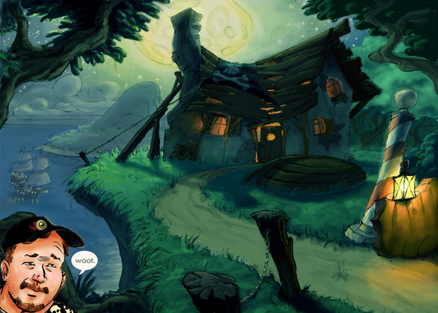
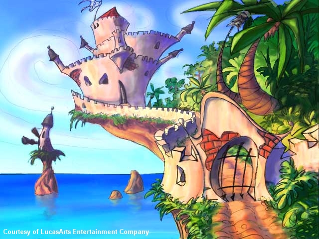
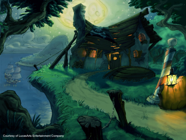
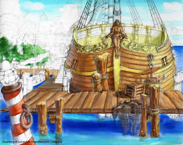
Welcome to The SCUMM Bar's Exclusive Interview with Bill Tiller... the artistic genius behind the backgrounds for The Curse of Monkey Island and The Dig. We promise you a great interview, with details of the art process used in CMI, exclusive never before seen concept art and a very special surprise at the end.
Interview by Ian "Skyfox" Biggar. Editing and Additional Art by Heather "Chariset" Oglevie
Please introduce yourself first.
Howdy. My name is Bill Tiller and I worked at LucasArts as lead background artist on The Curse of Monkey Island, and was the lead artist on The Dig and Indiana Jones and the Infernal Machine. Now, I am lead artist at Arena.net an online game publisher and developer started by three Blizzard programmers. I was born in Indiana but spent most of my childhood in suburban Chicago. Go Bears! Then we moved to Orange County California home of Disneyland. Ever since my family got our first computer, an Apple II+, I have always wanted to make video games. I learned a bit of BASIC and made a few crude games, but that is the extent of my programming career.
How did you get to work at LucasArts?
Back in 1992 I was just about to graduate from California Institute of the Arts in Los Angeles when I met Colette Michaud. You might remember her name in the credits of a lot of LEC and Lucas Learning games. One of the privileges of being a senior at Cal Arts was that I got to put my portfolio up on display in the main gallery so that potential employers could get a good look at it. And that is exactly what happened. Colette was looking for a character animator to work on The Dig-Brian Moriarty’s version. My work was mostly pictures painted using an old Amiga program called Digipaint (Amiga fans out there will remember fondly Digipaint), and she asked if I did any animation. I showed her my reel, which consisted of animated shorts I had done in Deluxe Paint Animator and in traditional paper and pencil. She really liked it. (I looked at it recently and man, does it suck! I am lucky I got a job with it.) A few months later I was invited up to Lucas Arts to do an animation test. The test consisted of painting Boston Low over a small video captures of Brian Moriarty on the PC version of Dpaint. It was basically rotoscoping (tracing video footage). I didn’t think it was a good test for my character animation skills. So after I finished the test, I quickly roughed out a short animation of a short fat dragon trying in vain to fly. That seemed to impress the guys in the art department and so a week later I was hired.

What qualifications do you need?
To be an animator one really needs to hone their traditional character animation skills. And what I mean by traditional animation skill is the type of animation used in Disney feature length animated movies and animated TV shows. To be good animator it is imperative one know how to draw the human figure, even if someone is animating a really exaggerated character like Guybrush or Blondebeard. My teachers really stressed to us the importance of taking as many figure-drawing classes as possible. So the route in to LEC -at least as an animator- is a.) Take many figure-drawing classes, b.) Create a short (30seconds to a minute length) traditionally animated movie (black & white pencil sketch animation is just fine), c.) Go on-line to Lucasarts.com; look at the job listing and portfolio guidelines, d.) Send reel and portfolio in to LEC (with release form), and e.) Get great job at LEC! To be an artist I would suggest doing a lot of still life drawings and paintings. Then create some imaginative imagery to show that you have a good imagination. This is key if you want to be a concept artist. Once that is done, then learn how to model and texture using a 3d package.
How long were you at LucasArts?
I got hired July 13th 1992, or at least that is what is said on my pay stub every week. I worked there for about eight and a half years.
What games have you worked on so far?
Let’s see. The Dig (PC, MAC), Rebel Assault (PC, MAC), Super Return of the Jedi (SNES), Indiana Jones’ Greatest Adventures (SNES), Curse of Monkey Island (PC), Indiana Jones and the Infernal Machine (PC, N64) and JarJar’s Journey (PC), a Lucas Learning game. I also worked eight months with Larry Ahern on an unannounced game and two months on another unannounced game with John Knolls.
How did the art process in the games differ?
The SCUMM games all pretty much had the same art path, except for Monkey III. I had to take the extra step of reducing the colors for the background art from 8 million to 245. That was a big chunk of work we didn’t have to do on The Dig. Rebel Assault was fun because I got to videotape friends of mine at work and put their faces on minor characters from the Star Wars movies. Vince Lee and I would screen grab a still from a videodisc of one of the Star Wars movies, and then we would videotape one of our fellow employees, Steve Purcell or Wayne Cline for instance. We would tape them talking and then using Photoshop and Dpaint I would blend their heads in to the previously captured scene. I also got to do a lot of special effects animation. The Nintendo Games were fairly easy to work on due in part to the Nintendo system's limitations. But it was still challenging to try to get good animation out of only three frames. The most fun I had was creating the Mode 7 art for Indiana Jones’ Greatest Adventures (Mode7 was used for simulating ground movement in perspective for vehicle levels). I enjoyed the challenge of getting the art to look right Mode 7. The Curse of Monkey Island was the easiest game for me to work on because the game was in high-resolution (640x480). The previous games were all done in 320x200 pixels. It was hard to get fine details and colors to look good in low resolution. I had also mastered Photoshop at that point and that sped things up considerably. I actually had time to draw every background in the game in pencil, and still had plenty of time to paint about fifteen of them. I had a really good painting crew who did a wonderful job painting in my drawings. Kathy Hsieh who worked on EMI was one of them. Maria Bowen, now a matte painter at ILM was the other. Working with Jonathan Ackley and Larry Ahern was great. They both had wonderful senses of humor, and put a lot of trust in me to develop the look for the backgrounds. And most importantly they showed a lot of patience with my eccentricities (which means I can be a pain in the ass). On Jones 3D, I got work with Hal Barwood who is a strong visionary and has good game design skills. Jones was my first real time 3d game and at first I was really out of my element. I was a little intimidated by working in the low polygon environment, but eventually through perseverance I got the hang of it. In the end it turned out to be a lot of fun. I drew conceptual designs of key locations in the game based on the descriptions in the game document. I directly oversaw the texture art development and I also got to try my hand in lighting design, special effects animation and puzzle design. Indy 3D was the biggest game I had ever worked on for sure. The best thing about working on Jones 3D was getting to know the great bunch of guys who worked on it, all very talented and fun.

Where did you work before joining LucasArts and doing what?
I didn’t work anywhere full time. I had done some art for a company called Zax Interactives that made interactive business proposals. Their big client was a company that manufactured bathroom stalls that were resistant to graffiti. I finally saw one of those stalls at Universal Studious once. And what do you know? They really worked. No graffiti!. I also did some storyboards for a production company that was doing a low budget rip off of Blue Velvet starring David Carradine. At Cal Arts I had done animation and art for a couple of student films that made it into Spike and Mike’s animation festivals and on MTV. No pay though. Hey! That reminds me - they owe me money!
Are there any artists (in the games industry or otherwise) that you view as your inspirations?
Steve Purcell, Peter Chan and Bill Eaken are my biggest influences in the gaming industry. They are art gods as far as I am concerned. I got to see how they did their art up close and learned a lot. One of my biggest thrills ever was getting compliments from all three of them on my work on CMI. That is the reason why Steve Purcell didn’t do the cover for CMI. We asked him to do it, but Steve said that we had created such a great look for the game that we, Larry Ahern and I, should be the ones to do the cover. We were a bit stunned, and very honored. After he said that, I began to think we had created something that might not suck. Bill Eaken did some work for us during crunch time and he said he loved the style and was going to use my Photoshop technique in the future. I thought, "Wow! He was the teacher, but now I am the master!” or something like that. There are a number of games that have good art, like the old Kyrandia games from Westwood. Diablo, Warcraft and the Starcraft games are beautiful. Spyro the Dragon has great color and design. Rayman 2 is beautiful! If we were to do a real time 3d Monkey Island game I would hope we could make it look as good as Rayman 2. Rush out and get that game ASAP! Tomb Raider 1 at the time was gorgeous. I love the Baldur’s Gate games. Games are, for the most part, looking a lot better then they ever have in the past.
