
As fans, you probably all eagerly witnessed the LucasArts 20th anniversary celebration on the official company website. You probably also remember that one of the first articles published on the site was a detailed history and description of the LucasArts “Gold Guy™” logo.
The description, which explored the symbolism and ideas behind the little gold guy, was generally well received by the community. Some fans, however, considered it to be a "dull corporate-esque discussion of the creation of their new logo."
After Mixnmojo casually mentioned the website’s 20th anniversary logo description to a few former LucasArts employees, a different story began to emerge. One former employee even referred to the website’s description as “drivel”, stating that “the logo was not created inside or even for the games group.” Indeed, it seems that the LucasArts logo and even the name of the company itself may not share the same origins of that portrayed by its corporation.
The story written below should not be taken as absolute fact, but rather as an account confirmed by several different former employees who worked at the company during the period surrounding the logo’s creation.
Once upon a time...
The games group of LucasFilm first began to develop in the early 1980’s. Because the world of video games was still in its infancy, the upper management at Skywalker Ranch didn’t quite know what to do with this new company. LucasFilm Games found itself being reorganized every 12 months in hopes that the division would find its proper place.
At some point in the very late 80’s or early 90’s, the games group combined with both ILM and Skywalker Sound. This particular merger was formed in order to unify all of the creative Lucas companies while remaining separate from the licensing and legal departments.
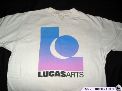
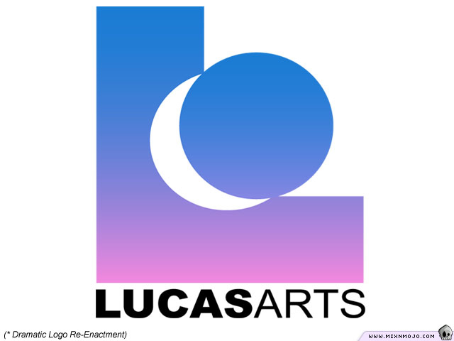
This new merger of creative companies needed a name. “LucasArts” was chosen, probably because the word “arts” is an all-encompassing term that could represent any video game, feature film special effects, or sound mixing. A logo was initially created and printed on company t-shirts. However, it was soon pointed out that this first design looked too similar to the California Lottery logo.
In hopes of finding something truly unique, the management decided to hire an external deign company to create a new, visionary logo for LucasArts. As you can imagine, this didn’t sit well with many of the internal employees. Some of the Lucas artists felt that they should have been given a chance to design their own symbol that would later represent their work.

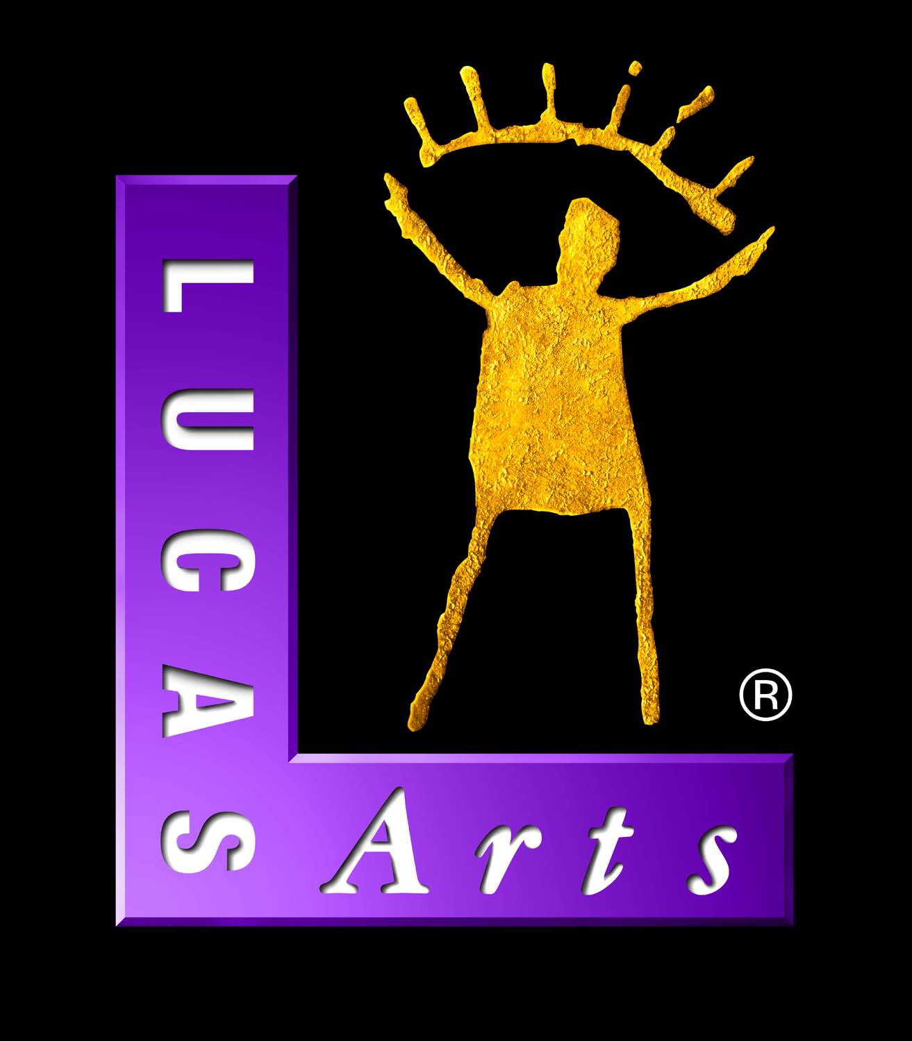
Despite these objections, the new logo was created by the external company and given to LucasArts along with a one-page description. This description was written by the designers in an effort to explain the meaning behind the logo and why it was so unique. The emphasis of this uniqueness fell on the symbolic eye formed by the gold guy’s arms and upper arc.
“The raw drawing of the eye is the symbol for the way we see things,” the description found on the 20th anniversary website states. “The sensation of sight is probably the most universal to the artist and to the audience of the art. The sense of sight provides prophetic knowledge of what may affect the more intimate senses of taste, touch, and hearing. What is to some viewers an eye is more directly to others a human figure with outstretched arms. What are eyelashes on the eye become expressions of thought, ideas and excitement.”

Apparently, some of the employees at LucasArts felt that this idea wasn’t unique at all. One artist even started a collection of other corporate logos that incorporated an identical theme. An example of this can be found in the logo belonging to the National Film Board of Canada. Rumors began to circulate around the office about how much management paid for this new logo, but no one could confirm the actual cost.
Yet another reorganization occurred some time after that. For whatever reason, management decided to divide the creative companies to what they once were. ILM and Skywalker Sound each split off to resume their separate operations. LucasFilm Games, on the other hand, inherited the brand of LucasArts; a name and a logo that were not specifically created for the games group.
When it came time to celebrate the 20th anniversary, it isn’t hard to imagine that someone found this one-page description written by the outside design company and put it up on the website. Of course, there are probably very few (if any) employees still working at LucasArts who were around to remember the internal dissatisfaction with the logo.
Now that ILM, Skywalker Sound, Lucas Licensing, and other branches have once again reorganized to form a single company, what will happen to the name LucasArts and its logo? Who knows what may be in store for the once controversial “Gold Guy™.”