Articles

Jonathan Ackley and Larry Ahern look back on 25 years of CMI Page One
After a quarter of a century (papapishu!), the monkeys are still listening, the slaw continues to be insufficient, and Mojo improbably remains standing to pester the project leaders of the third Monkey Island game, the first of the internet era, on this prestigious anniversary of its release and SCUMM's final voyage.
There seemed to be a pattern at LucasArts of pairing up project leaders. Dave Grossman and Tim Schafer. Mike Stemmle and Sean Clark. How did the two of you end up becoming partners in crime?
Jonathan: At the time, Larry was reading a book on hypnosis and I bet him $25 bucks he couldn’t make management green-light Monkey 3. Egg on my face. Suddenly, I owed Larry money AND I also had to make the game. We had complementary skills. Larry is a talented artist. I yodel. It was the perfect pairing.
Larry: The co-project lead structure made a lot of sense. Most of us have no idea what we’re doing the first time out (and sometimes still, even after 25 years). But if you have a co-lead, there’s always someone else to blame it on help solve those tricky problems. Jonathan and I had worked together on several projects previously and worked well together. We were also both interested in having more creative control. And, most importantly, I was one of the few people who could handle sharing an office with a yodeler.
How did the project come about? Even in the mid-nineties, you were lucky to see one adventure game put on LucasArts’ annual release schedule, and in five years’ time the jig was up altogether, so I imagine brand recognition was helpful in getting the green light shone.
Jonathan: Management wanted a Monkey 3 and asked us. We were the 2nd choice, though. Jane Goodall had the right of first refusal.
Larry: Yeah, it wasn’t a tough decision. We wanted to lead a project, management wanted another Monkey Island game. We were too green to suggest anything else (especially an original concept), and were too dumb to worry about all the responsibility of updating a beloved classic game series. Lucky for us the internet wasn’t very big back then, so there was no risk of hearing any opinions about how we might screw it up (Jane especially might have been unforgiving).
Between the two of you are credits on Monkey Island 2, Day of the Tentacle, Sam & Max Hit the Road and Full Throttle, which is to say that your SCUMM bona fides were firmly established by the time you got the opportunity to helm Curse. Outside of the obvious influence that the previous Monkey Islands would have had on you, can you think of how your experiences on those other projects might have informed your approach to the design and visuals of Curse? Generally speaking, where were you or the company as a whole hoping to push a LucasArts adventure game in 1997?
Jonathan: You left out a couple of versions of The Dig. Doing the game with visuals was Larry’s idea. I wanted to do it as a text adventure.
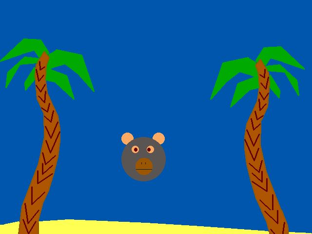
Larry: It was our first fight, but given that my previous job title had been ‘artist,’ I finally convinced Jonathan that the game needed art. Of course, once he got onboard, he started trying to do his own art (the famous Bear-Pig load screen - search the internet, you know it to be true).

On Full Throttle I was already pushing for a more cinematic experience, but we didn’t quite have a big enough team to do it justice (there was a lot of crunch to finish that game). So on Curse, we made sure to come up with a more realistic production plan, we got the company to buy us a digital ink & paint system so our animators could do faster/better hand drawn animation, and then we hired a bunch of insanely talented Sheridan College graduates to bring the thing to life. We were looking at Disney feature animation as our quality bar and really hoped to wow our audience with a giant step forward.
While the first two games were developed back-to-back with considerable continuity between teams, The Curse of Monkey Island arrived six years after its predecessor. That hiatus built up a driftnet of technological advancements to reflect, and it was also enough time for most of the previous creative leads to have moved on from LucasArts (Ron and Dave) when they weren’t on other projects (Tim). In other words, Curse was a revival of the series as much as a continuation. Was it an intimidating prospect to try recapture the spirit of the old games when their relative crudity allowed players to project a lot more onto their experience, or did you view it more as an opportunity to forge a new path and refresh the series?
Larry: I really think our creative process was continually growing from game to game, so the direction we wanted to take Curse was just the next logical step. And having completely redesigned the look of the characters and world of Maniac Mansion for Day of the Tentacle - to great success - made me confident we could evolve the art style of Monkey Island for Curse. I personally love seeing new takes on favorite projects, so I realize that some fans were not as excited, but we always made sure that the primary focus was on being true to the characters and world created by the original team.
Jonathan: We weren’t intimidated because we had done so many adventure games before. The part that was most daunting was the scope. We knew a Monkey Island game had to be a very big game. As production values go up, so do the costs. There was a general worry that we wouldn’t be able to deliver a big game without plowing out the budget. A large amount of effort went into setting up efficient processes in order to create a deep gaming experience.
On a similar point, I found an old interview which purports that Tim Schafer told you guys, by way of advice, that “You’re not competing with Monkey Island 1 and 2. You’re competing with the memory of Monkey Island 1 and 2.” How did you balance a known inability to please everyone with an intent to honor the prior games?
Jonathan: As Ricky Nelson once said, “You can’t please everyone, so you’ve got to please yourself.”
Larry: As I mentioned above, thankfully the internet wasn’t much of a thing back then, so we were able to stay in our little bubble and just focus on what we thought would make a good game. We knew we wanted to change some things, but those changes were all intended to push the game further in the direction that felt right for the characters and world. We knew we wouldn’t make everyone happy, but I think we were all more excited about evolving the series rather than retreading what came before. A sequel has to move forward - if you just rehash the last version, nobody’s happy.
The game’s exaggerated art direction was a big swing that was also only made possible by the aforementioned tech leap. The results are objectively beautiful and, having replayed the game recently, have probably aged the most gracefully of all those games. Larry, can you speak a bit about your vision for bringing the series into the hand-drawn realm, and how you and Bill Tiller (and the rest of the art/animation team) collaborated to pull it off?
Larry: The most exciting part was knowing we had the palette and resolution to deliver some gorgeous hand painted backgrounds that would really make the world of Monkey Island seem more like a storybook or animated film. The previous games had amazing art, but the tech limitations always crunched it down to a lesser version of the original illustrations. So right from the start, we talked with Bill about going nuts with a beautiful, detailed color. I think we did some early tests with a watercolor look, but it felt too washed out, so we very quickly switched to a richer palette and higher level of detail. And Bill’s a master at color and lighting, so once he started pushing that, we knew we were onto something. He did a ton of research (even went to the Caribbean - on his own dime). And we definitely hammered on it for awhile - he’ll tell you that I sent him back to the drawing board a few times, but I think the end result was worth it.

As for exaggeration or stylization, that was something that I wanted to push as well. I love warped and caricatured elements that feel recognizable but pushed - both in character design and environments. So Bill curved and bowed the walls and barely used a straight line in the entire game. And I pushed the characters similarly. While I loved the first 2 Monkey games, I always felt that the tone of the writing was more comedic than the art let on (especially the box art, though it’s insanely gorgeous). So I wanted to make the characters a little more cartoony to reflect the way the world felt to me. I did a lot of crazy, really extreme versions of the characters early on and kind of got bogged down in something that wasn’t working. The animation team kept me honest and pointed out that I was talking about wanting feature quality full animation, but some of the characters I was drawing were more primitive (a contradiction). I realized they were right, so I delegated some of the design work to them and they were able to use my roughs as guidance and pull together the final characters you see in the game. Sorry… I see now I’ve written a novel here.
The game was released at a time when 640x480 was quite high-res, allowing hand drawn backgrounds and character sprites to be scanned in with reasonably fidelity; the animation of the game was often compared to feature film caliber. Can you walk us through the ink and paint process, since I imagine it would have been substantially different from how SCUMM characters were animated in prior games?
Larry: Very different. I will start with this disclaimer: I’m not super technical, and it was 25 years ago, so take my answer with a pound of salt (or maybe Jonathan can correct any errors).
The biggest thing about going high rez on the game was that we were able to capture so much of the subtle detail in character’s faces, and use full outlines around the characters (which helps better define them and make them pop against the backgrounds). That also meant that for the first time we could scan a paper drawing in and it would retain the detail of the original. And drawing on paper was a lot faster. Making this shift then allowed us to break apart the animation process and let artists specialize like they do in feature animation.
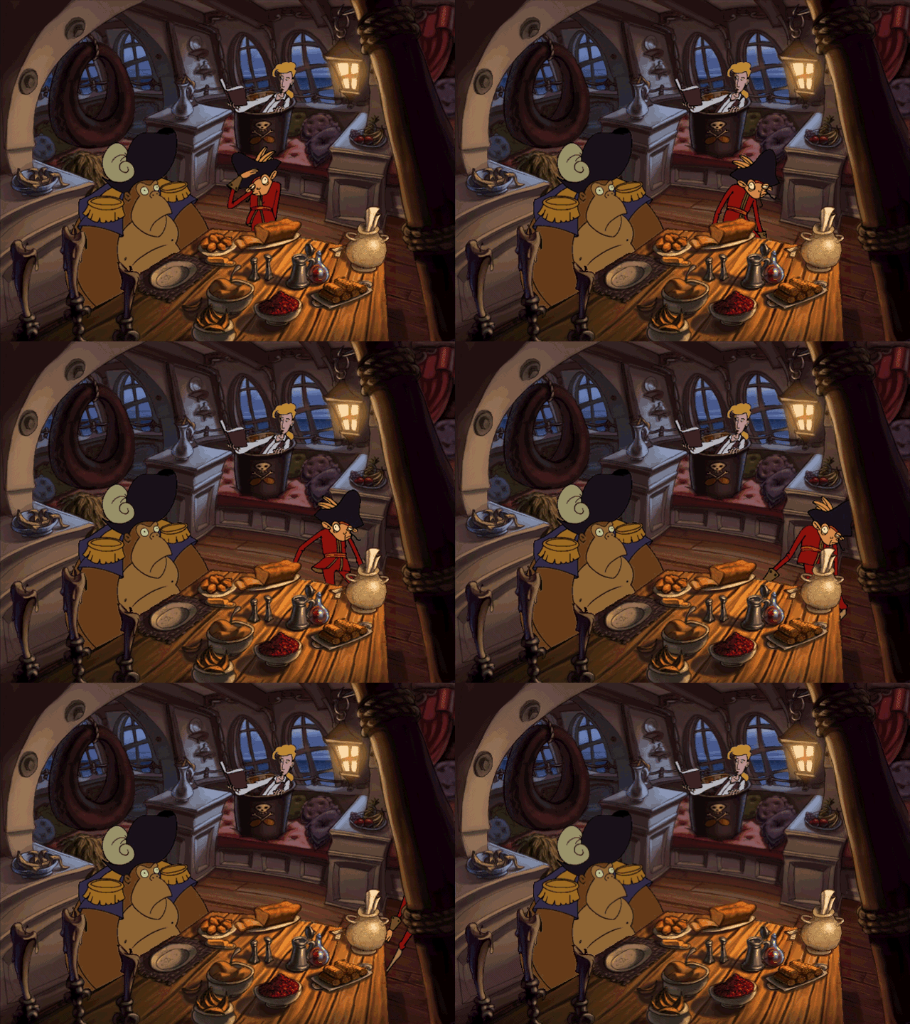
Games used to require the animator to do everything start to finish, but with our high rez scanning process meant that the top-tier animators could rough out the drawings on paper to get the form and movement right, then they would hand these off to a junior animator who would cleanup and refine the lines of the drawing. This was also a great way for them to learn by studying the work they were refining. Then the cleaned-up versions would be batch scanned into the USAnimation digital ink & paint system and turned into vector art. This allowed the ink & paint artist to scale things as needed without worrying about resolution. They would then darken the lines to black, and fill in the color areas based on a reference color model, tweak the colors to match the different lighting unique to the scene, then composite the animation onto the background if it was a cut-scene, or antialias the edges to a midtone that made the interactive character blend well when playing over top of most backgrounds.
Recently someone pointed out that aside from Guybrush, none of the characters in the game have true “walk cycles.” I made a point of looking for an exception to this claim when I did my replay and I was astounded to find this to be almost entirely accurate trivia. (Almost, because I did notice that Mr. Fossey in fact walks away after you trick him with the ventriloquism book.) It never would have occurred to me had it not been pointed out, but now that it has been, can I assume it would have been too expensive to have characters pacing around the backgrounds for its own sake, which was easier to do in the earlier games?
Jonathan: It wasn’t about walk cycles being too expensive. They simply weren’t needed for those characters.
Larry: Jonathan’s right, but let me repeat what he said and take the lion’s share of credit because I have art director credentials. And now maybe I’ll expand on it a little more so you forget me blatantly stealing his answer: most of the early SCUMM games did not plan out scenes and animations beforehand because often the story details hadn’t even been written yet. Programmers would just ask for a functional character with a walk/talk/reach animation, then they could use it to do most of what they came up with as they scripted the scene. That worked okay because walk animations didn’t take that long with smaller, low rez characters and the engine couldn’t really play anything more elaborate anyway (like a special case animation).
But as the tech advanced and everything got more expensive, we realized we needed to plan the scenes more thoroughly first. Once we did, we discovered that walking around was the least interesting action a supporting character could be doing. So unless it was critical that a character go somewhere for Guybrush to follow, most of the time we put the effort into gestures and other funny character-building actions.

I found a March 1998 post-mortem by Animation World Network to be an invaluable resource on the game’s development process. Larry, in it you noted that an “alligator game” had to be cut from the design in a cost-cutting move. Any chance you can remember what that was about?
Jonathan: I have no memory of an alligator game, but then again, it was 25 years ago.
Larry: I have no memory of an alligator game either. But, then again, I have no memory of Jonathan yodeling. So maybe it was real, maybe it was just something said as a joke, or maybe the interviewer made it up or misunderstood me. If I wanted to be really thorough, I could probably go dig out that box in my attic full of notepads where we wrote down every single dumb idea we had. But I need to leave something for the historians after I’m gone. (Coming in 2075: the 3-volume series The Genius that Could Have Been: The Curse of Monkey Island’s Alligator Game)
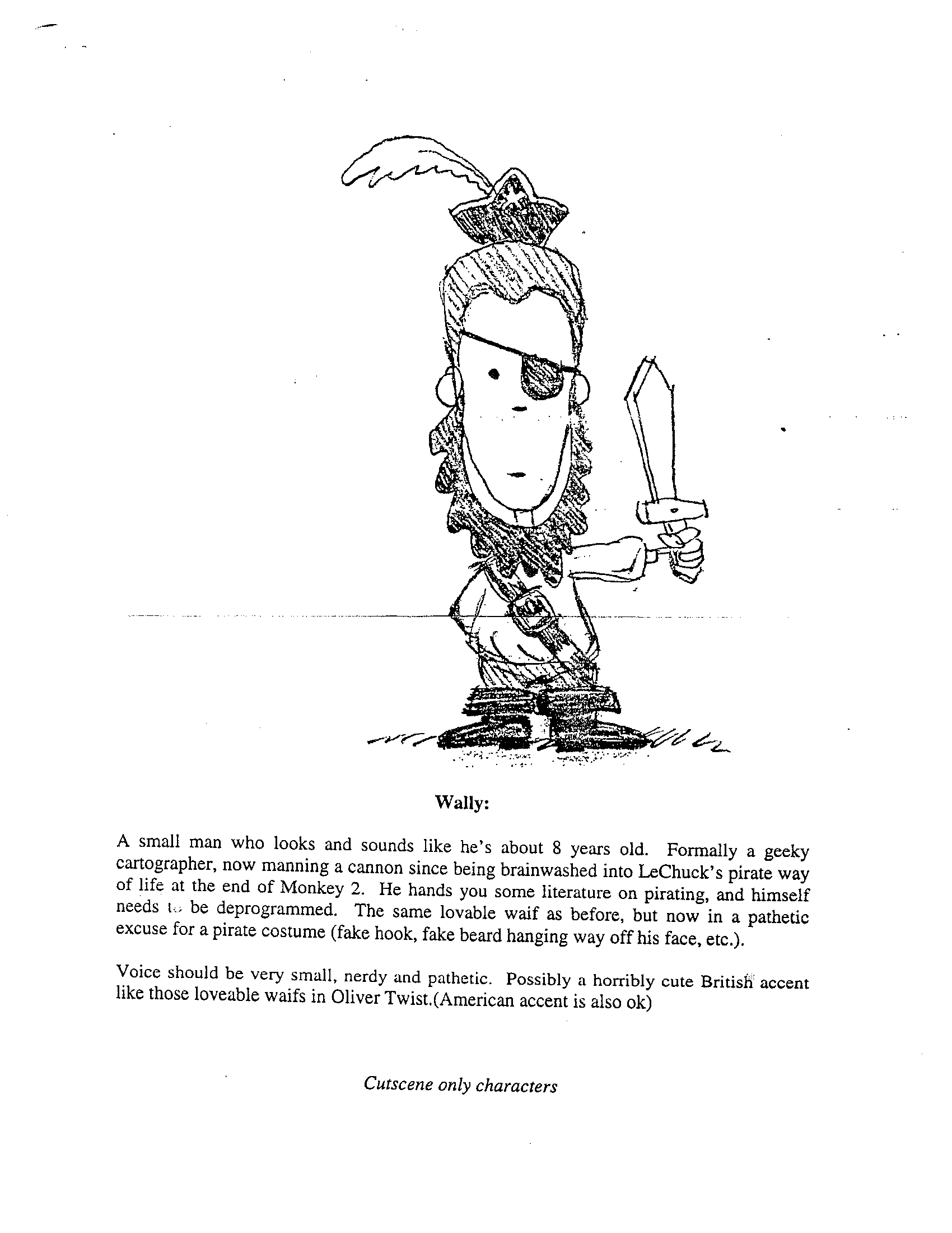
Speaking of ideas that fell by the wayside, let’s talk a little about how the storyline and design came together. You’ve spoken a few times about how the plot of the game was originally rather different, with Elaine turned into a wooden ship’s mast rather than a gold statue, LeChuck trying to marry Elaine in an undead ceremony, and Guybrush having to ritualistically return the wedding gifts. I also understand there was a scrapped idea for a sequence set at LeChuck’s summer home that featured Guybrush exorcising a possessed Wally with a croquet mallet along with the return of the Voodoo Priest from LeChuck’s Revenge. Do you remember any other details from these early drafts and why you ultimately went in a different direction for the story?
Jonathan: New ideas just came in and crowded those ideas out. There are tons of ideas at the beginning of a project. We tried for a while to shoe-horn those in, but realized they no longer fit the story we were telling.
Larry: I was digging through my old docs for something else and came across the first pitch that detailed that whole sequence. It’s kind of fun, but I think it was an attempt to plot out the intro while only having a rough idea of where the rest of the game was going. Once we figured out the rest a little better (and discarded a bunch of bad ideas), this intro didn’t make sense anymore.
The first concept started from the perspective of thinking what kind of fallout there would be after Guybrush interrupts LeChuck’s attempt to marry Elaine. And we thought there’d be all kinds of treasure/wedding gifts and wouldn’t it be funny to make our pirate character have to run around and give treasure back (i.e., return the wedding gifts) instead of steal it. Then we realized that was funny for about 5 minutes but wouldn’t work for an entire game.
But what I loved about the original intro was Wally was possessed by a demon and would switch from meek, lovable Wally to Linda Blair from The Exorcist. Then you trick him into popping his head up through a gopher hole in the lawn from the tunnels below and the Voodoo Priest whacks him with a croquet ball which drives the demons from him. We lost most of that, but still kept a variation of it by having Wally brainwashed into joining LeChuck’s crew.